
Institution
Specialist Diploma in User Experience and Digital Product Design
Course Unit
User Interface Design
Year
2023
Project Context
Diploma Project
Collaborators
Alisa Mahat, Joel Kuan, Priscilla Lam, Poh Zhi Nan
Overview
One Kilburn is an alliance of local people, organisations, and businesses, working together to improve the quality of life of everyone in Kilburn. One Kilburn encourages collaborative, community-led activities throughout Kilburn, and across their three boroughs - Brent, Camden, and Westminster boroughs.

19 Outlets and growing

Order in store or on their website through a third-party

Majority of the outlets are located in CBD

Specialises in viennoiseries and coffee

Current user journey
Delivery orders on website
Browsing


From TBB’s website
Accidentally clicked on the “Takeaway menu” option instead of delivery

Landing on delivery site
Confused by the landing image of hand soap on a bakery website.

Browsing through menu
Overwhelmed by the wide selection of products with similar images.
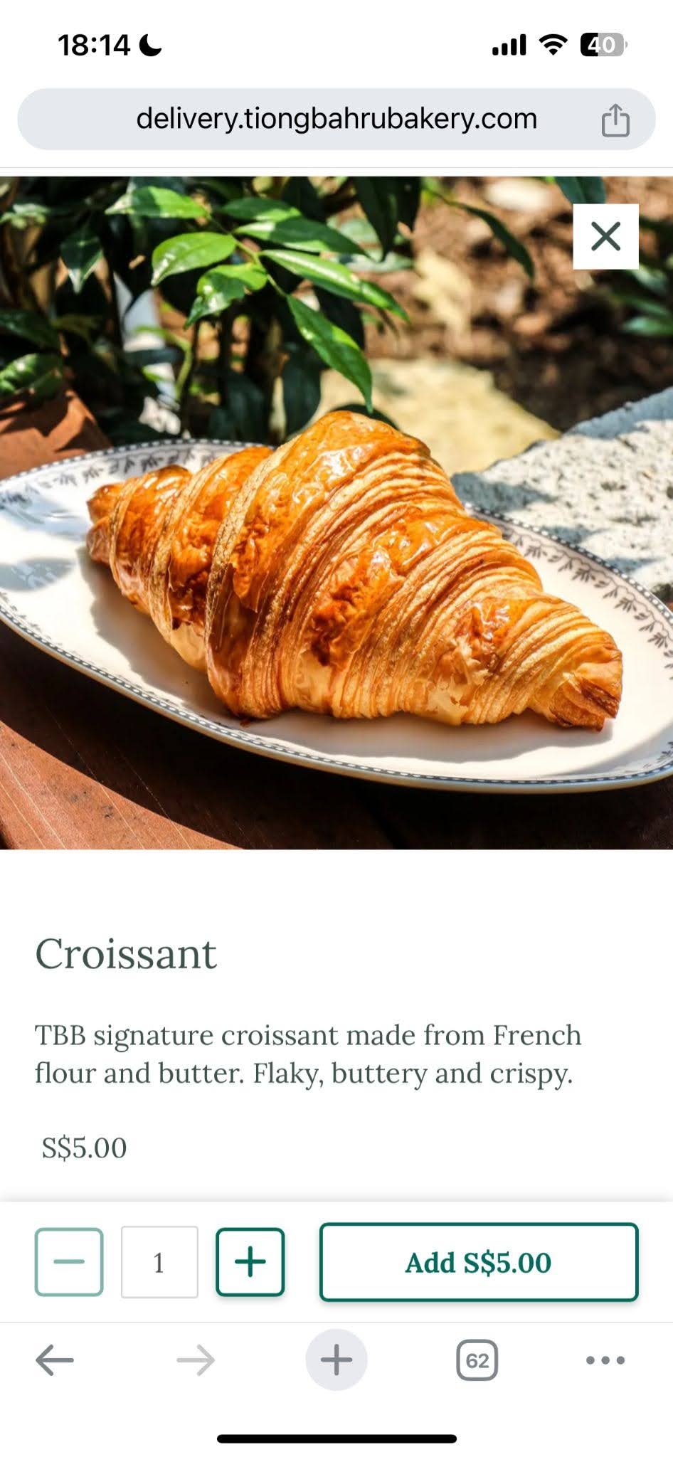
Browsing product detail
“I guess they don’t allow customisations for online orders”
Delivery orders on website
Checking Out

Selecting Pickup or Delivery

Selecting store

Specifying details
Delivery orders on website
Payment

Selecting date and time

Browsing cart

Proceeding to order
“I have to log in again? I’m pretty sure I’ve ordered online before. This is too troublesome, nevermind.”

Things That Could be Batter
Identifying pains and gains
01
Unclear Menu
Menu is unclear…
…Thus might hinder the ordering process as the user might lack confidence in what they are ordering.
Coffee is represented with graphics which is not very helpful if there is no legend. The user would have to rely on the description or the name of the drink.


The UI of the product page does not show or suggest to the user that there are additional options to customise the item (Option to add some kaya or to instruct TBB to not heat it up).
This might lead to loyal TBB customers feeling confused and frustrated since these are customisations that can be done in stores.


02
Inefficient Checkout
Current user flow requires one to log in everytime they want to make an online order/takeaway…
… This user flow will be inconvenient for a repeating customer.


03
Constricting and Rigid Brand Identity
Current branding has limited colour palette…
… thus designing becomes restrictive, leading to UI and UX issues such as lack of visual hierarchy.
Moreover, the dated look and feel no longer resonates with the brand…
…since they have departed from being a quaint bakery to a multi-outlet chain serving up viennoiseries for fast-paced consumers in the bustling town area.


04
Grab and Go
For repeating customers who already have a “usual order”, there is no quick and seamless way for them to grab and go…
… Without having to spend time scrolling through the menu to order what they want.

Project Statement
How might we enhance the ordering experience to be more seamless and hassle-free for repeating customers?


Grain-storming Ideas
Ideation and wireframes
Unifying Identity
Identifying key features of the identity to incorporate into the redesign.


Menu
To tackle the issue of unclear menu, we first laid out the key elements such as search bar, tabs, cards to categorise information in a clean and organised manner, so that it is intuitive and visually-appealing for users to navigate.
Chips and customisation toggles are adopted to take into consideration the diverse needs of users and provide them convenience in accessing these features
Experimented the container-shaped product photos and product listing cards which tie to the ideal TBB branding. Initially we thought of placing the quantity toggle in each card for easier editing of quantity, but realised it can make the interface overly cluttered and take away the attention of the product itself (i.e. lose visual hierarchy).


Product Detail
Another solution that was considered is having a tooltip with a legend similar to this reference.
However we did not go ahead with it as it is not very intuitive for the user. They would need to keep referencing the tooltip or remember the legend. This increases cognitive load of users.
We also created the illustration of how the drink looks like, but we realised how it may cause visual overlap/repetition to users, so we eventually decided to simplify the design by using the actual image with the labels.
Homepage
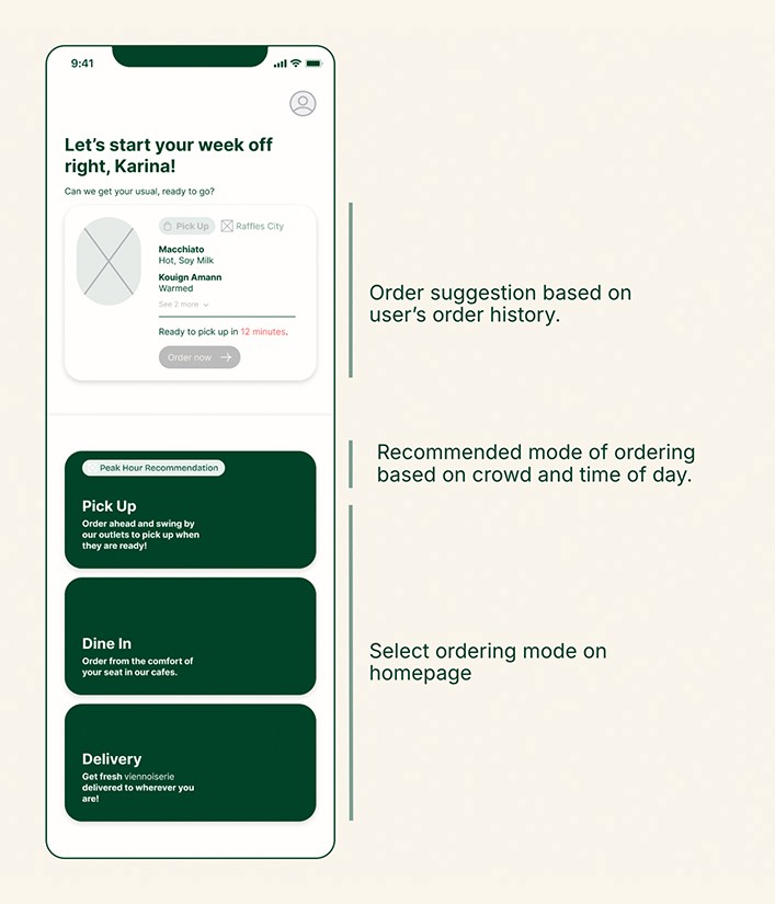
Delved into the idea of personalisation through a card design on the homepage which will suggest a user’s usual order based on their order history for seamless and intuitive ordering for repeated customers.
Cards that show the different modes of ordering that the app is able to fulfil - experimented with various shapes and layout.
Initially wanted to put the ‘peak hour reco’ tag outside and highlight the recommended mode for it to be distinctive (prioritisation of element), but it can be too striking to users. Also made the spacing of the delivery options closer to each other (i.e. proximity) to highlight that information is related to each other (Law of similarity, proximity, uniform connectedness).
Finally, Let’s Roll!
Final Prototype and Style Guides
Style Guide
For colours, we adapted the emerald green and cream colour from the original TBB website with a warmer shade to provide a cosier image of TBB without losing too much of its original branding, as well as added a secondary orange colour to provide greater contrast on key call-to-actions and elements in our app.
Used Bricolage Grotesque and Inter which are sans-serif fonts to provide an overall clean and minimalistic look. We followed the 4pt rule for the fonts so that it establishes visual hierarchy and make information easier to read/compartmentalise. The strokes of the typeface also inject a friendly, personalised touch to reinforce strong brand identity and provide a pleasant user experience.
Prototype &
Hi-Fi Screens


Onboarding
Get first time users onboarded
Onboarding to introduce users to list of features. Paired with graphic illustration so users can digest information easily.
Intuitive swipe to go to next screen
🔩 Prototype Key Features and Interactions
Delay for loading screen to automatically transition to next screen
Smart Animate for swipe to scroll through onboarding
Animated graphic (.gif) for loading screen
Homepage & Ordering Mode
Seamless ordering regardless of mode
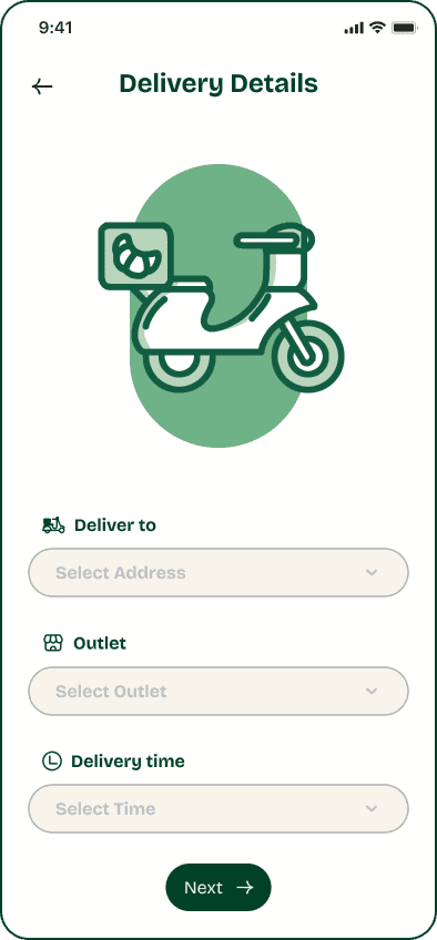
Ordering mode options on homepage allows users to quickly get to ordering
Users specify order details before proceeding to menu
🔩 Prototype Key Features and Interactions
Components for dropdown menu




Menu & Product Detail
Wider range of colours for better visual hierarchy
Efficient browsing: Tabs for Food and Drinks that users can easily toggle between. Chips to quickly jump to different categories
Clear images, mimicking the display cases in store so users can make make confident choices when ordering
Easy to customise item on product detail screen
Accurate depiction of items that is reflected even when users switches when choosing between hot and iced
🔩 Prototype Key Features and Interactions
Components for micro animation when tap and holding items in menu
Components when toggling between hot and iced variation of drink items / Food and Drink tabs
Sticky scroll behavior to keep tabs and chips on screen at all times
Variable and Conditional interactions to reflect the quantity in the button
Product Search
Find what you want and more
Pre-filled suggestion in text field and more recommendations below


Basket & Checkout
Clear layout and hierarchy for order summary shows to instill confidence before proceeding to check out
Users can intuitively swipe to delete
Efficient check-out: Users can browse through saved payment methods
Preview of order that expands to show more items.
Animated success graphic to further assure users that their order has successfully been submitted (Usability Heuristics #1)
🔩 Prototype Key Features and Interactions
Smart Animation to swipe and reveal delete button
Components to remove item from order summary
Variable and Conditional interactions for when basket is empty
Animated illustration (.gif) for success screen
Personalised Homepage
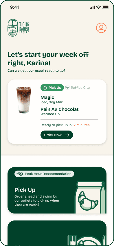
The app shows current active order and utilises the user’s ordering habits to give personalised recommendations
Keep updated with the current active order. This will be shown on homepage and users can tap in to see order details
Personalised suggestions to order a past order based on time and location of user
🔩 Prototype Key Features and Interactions
Smart Animation to swipe and reveal delete button
Components to remove item from order summary
Variable and Conditional interactions for when basket is empty
Animated illustration (.gif) for success screen


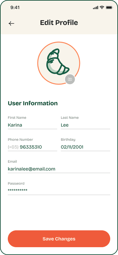

Profile
For a seamless ordering experience on the app, users can save their details in profile
Update user details
Add payment methods
Add addresses to save
Users can also see past orders that they can reorder easily.
The Proof is in the Pudding
User Testing Results

User L
“The food ordering flow is similar to other apps which made it easy to understand. It gives me a sense of familiarity and makes the process almost second nature.”

User K
“I find the app and illustrations overall very aesthetically pleasing which makes it more pleasant when navigating through the screens.”

User M
“The colours are comfortable to the eye and ordering process is very straight forward as the products and categories are easily distinguishable.”
