
Poke Theory – A Self-Ordering System for Personalised Customisation and Efficient Checkout How we decided to redesign Poke Theory’s self-ordering system for users to grab healthy and customised meals more efficiently
Institution
Specialist Diploma in User Experience and Digital Product Design
Course Unit
User Experience Design
Year
2023
Project Context
Diploma Project
Project Context
Poke Theory is a food-first concept serving modern poke bowls, with the option of customisation as well in order to cater to people with various dietary needs. They also serve acai bowls, healthy snack packs and beverages.
Poke Theory takes on a spin of poke bowls, a dish with Hawaiian origins, to offer its customers a wide variety of healthy and nutritious ingredients that they can customise. This is perfect for health-conscious busy professionals that are looking for quick nourishing meals. Poke Theory’s colourful assortment of ingredient choices also makes their bowls highly photogenic, perfect for those who eat with their eyes first.
THE CHALLENGE
Create an intuitive and efficient self-ordering experience
At their Suntec outlet, the strain on the staff’s manpower during the lunch time peak hour can be alleviated by ordering kiosks fitted at the front of the chain. This way, customers can choose between ordering from the staff at the front counter with the benefit of seeing the array of displayed ingredients or they can order from the ordering kiosks.
In theory, customers are able to have another option to order swiftly and have shorter queueing time. However, due to several issues with the user interface and user experience, customers experience more hassle and take longer to complete their order, leaving them hangry.
Here’s some of the issues we have discovered through design thinking processes and will be tackling in this case study.
1
Build Your Own Bowl Experience
The Build Your Own Bowl feature allows users to create their desired poke bowl. They can pick the size, type of poke, base ingredients, toppings, garnishes, and sauces. They can also opt to add in premium toppings or upsize the amount of poke.With this self-order kiosk customisation experience, customers expect a clear, systematic and self-explanatory navigation flow given the lack of guidance in this customisation experience. Ingredients displayed on screen that are available as part of this customisation experience should also be neatly laid out for easy browsing and selection.However, customers encountered difficulties with customising their Poke bowls due to the absence of images for certain ingredients, impeding their ability to identify these items and visualise how their Poke bowls would turn out. Additionally, the interface suffers from visual clutter, as numerous lines of text are present without a clear visual hierarchy, resulting in an overwhelming amount of information for users to process.
Other issues we found was that users are unable to add multiple servings of an ingredient. Also, there was no ‘back’ button to go to the previous page and instead in its place was a ‘cancel’ button. Often, users find themselves accidentally cancelling the whole process of customising their poke bowl when their intention was to go back to the previous page.

BYOB - Selecting Poke
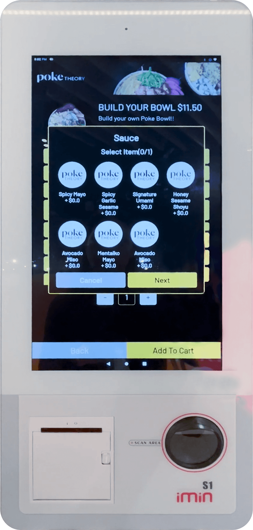
BYOB - Selecting sauce
2
Filtering for dietary needs & preferences
Poke Theory caters to those who are health conscious, offering a variety of ingredients to suit the pickiest taste buds and the strictest diets. Naturally, customers at Poke Theory will be more mindful about the nutritional information, ingredients and indicators for common allergens.
However the ordering kiosk offers no such information. Fans of the fast-casual eatery would know that their website offers nutritional calculators and this feature can be integrated into their ordering kiosk to provide a richer experience.
We found that the items were only accompanied by images (where available and not missing) and users were not shown any information until the summary page after selecting the item. Users with dietary restrictions or preferences might have to remove the item and redo the process again just to identify the ingredients in each curated prebuilt bowls.
This arduous process worsens the user experience by making it difficult for such users to determine the items they can consume, thus lengthening the ordering process.
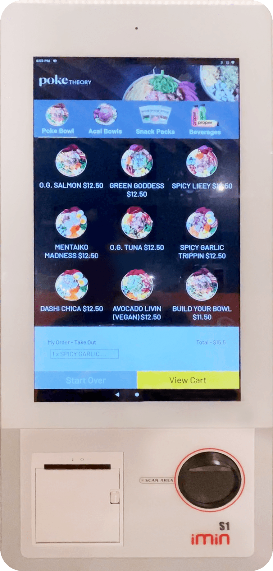
Poke Bowl section

Summary of selected Poke Bowl
3
Wrapping up their order at check-out
With all the selected items in their cart, users then proceed to payment and checkout. At this stage, we found that users face difficulty in deciphering the options and instructions on the payment screen. The poor accessibility caused by the usage of extremely small buttons and text fields leaves users confused and frustrated to proceed with the payment process.
Alongside a field to enter their email address, users were also presented with two methods of payment: PayNow and Card. When choosing the card option, users are instructed to manually fill in the card number and CVV number.
Compared to most other ordering kiosks where many options of payment method are given with one of them being the contactless ‘tap-to-pay’ way, Poke Theory’s inconvenient method ends up frustrating its customers and slowing down the checkout process.
As their main target audience are those who are on-the-go and head to the eatery for a quick nutritious lunch fix, this is not ideal. Moreover, these young tech-savvy users prefer to pay using their smart devices that are already loaded with their cards.

Check-out screen

Payment screen prompting users to enter email select payment method.
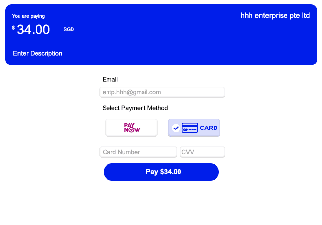
New fields appear after selecting ‘Card’ as payment method.
THE APPROACH
Designing for Users in Mind
We recognised the importance of shifting our focus from mere features to understanding the goals and needs of our users. Instead of constantly adding new features to differentiate Poke Theory from its competitors, we aimed to create a more efficient and personalised user experience to ensure we approach our project with empathy and user-centricity.
By leveraging on the Design Thinking Framework, this helps us go beyond superficial improvements and delve into the underlying needs, motivations, and pain points of users when ordering and purchasing their meals.
As we were proactive on a lean UX approach that fosters rapid wireframing, prototyping and user feedback, we managed to generate innovative ideas for an even more functional, customisable yet visually-appealing kiosk interface that would cater to the unique needs and preferences of our users.

Design Thinking Framework from Nielsen Norman Group
THE DISCOVERY
Customer Insight
Customers seek healthy yet quick and fuss-free options
We’ve zoomed into 2 user personas:

Asher, a 27-year old male, who works in a tech start-up and is a fitness enthusiast
For Asher, health and fitness is his top priority and he seeks out a holistic healthy lifestyle. He is highly motivated to live a fulfilling life and seeks to have a good work-life balance.
During working hours, he takes pride in what he does and fully invests his time to do well at his job and this results in him not having enough time to prepare nutritious home-cooked meals thus he tends to eat out more.
As someone who is very into fitness and works out regularly, Asher pays close attention to his diet and is very particular about his food intake.
Requirements
He actively measures the amount of calories he consumes – he needs nutritious and protein-packed meals in order to fuel his fitness regimes.
Due to the specific lifestyle he leads and fitness goals he wants to achieve, he knows clearly what he wants in his meals and often prefers to dine with food establishments that allow customisations so that he ensures he can pick the right ingredients and that he hits his calorie intake.

Hana, 30-year old office lady who works in a PR company
Hana works in the CBD area and is often busy throughout the day, running in and out of meetings.
Despite that, she prioritises eating well and also exercises regularly every weekend as part of her self-care routine.
Due to her busy schedule, Hana values time and convenience above anything else, and often avoids food establishments with snaking queues and long waiting times.
Requirements
With long working hours and often being caught in back-to-back meetings, Hana has no time for meal prepping, and barely any down time to herself during working hours. Grabbing lunch needs to be a quick and easy task, yet still healthy as she prioritises eating well.
She tends to gravitate towards establishments that have a swift ordering and collection process, with short waiting times. As someone who is also in her 30s, she looks out for payment methods that allow her to use her preferred credit card to gain points and miles.
THE FRAMEWORK
A more interactive and accessible design
Using the user goals, motivations and the identified pain points of our user personas, we could then scope out the ideal design for Poke Theory’s self ordering kiosk. Some insights gained were that the current layout is cluttered and confusing to navigate. Some of the language used in the interface was also misleading and led users feeling frustrated.
Main pain points to solve
Users feel confused when trying to build their own bowl as there are missing images and the layout is cluttered and hard to navigate.
Users with dietary needs have difficulty ordering from the kiosk as there is currently no indication that tells them if the items in the menu fits their needs
Users are not able to make payment in a way that is quick and fuss free
We then brainstormed and came up with 15 different How Might We statements as this aided in narrowing down what kind of solutions we would ideate.


‘How Might We’ statements
Eventually, we shortlisted 5 ‘How Might We’ (HMW) statements based on how well it addressed our users’ pain points and motivations.
With the Build Your Own Bowl feature, there are countless combinations for the customer to choose from but…
How might we make customization an easy experience for indecisive customers?
Customising your own Poke Bowl is an important USP for someone like Asher Tham who has strict macros to hit so…
How might we improve the UI of the self-order kiosk to make it more intuitive and easier for customers to customise their orders?
Users like Hana Khalid have certain dietary restrictions such as a vegetarian diet or being lactose intolerant so…
How might we improve the UI for customers so that they are able to order items that are suited to their needs or dietary requirements?
Both personas Hana Khalid and Asher Tham do not have much time for lunch and are mostly on the go so…
How might we make kiosk ordering fast and efficient for busy customers?
Using the 4 Categories method, we came up with a range of solutions for each of the HMW statements. The ideas ranged from being relevant and practical to the craziest and most creative ideas that we could think of.

Four Categories method
Even though we ended up shortlisting the more rational ideas to proceed onto prototyping, we found that the exercise was beneficial in getting us to think of more far-fetched ideas like having facial recognition to make ordering more efficient by remembering your usual order and re-ordering it for you without you having to touch a single button. It provided a unique perspective on future innovation of self-ordering kiosk experience.
As a result, we identified two main requirements for our design solutions.
The solutions proposed should:
Translating visual thinking into wireframes
We focused on prototyping 3 main features that would address our design requirements: Build Your Own Bowl experience, filtering menu items and checking out. Wireframes were made to identify how best to layout the components in a way that was easy to navigate and easy on the eyes. The screens were then refined up to low-mid fidelity and prototyped in order to conduct user testing.

Mid-fi Wireframe
Considerations
THE REDESIGN
Bringing colour to Poke Theory


FURTHER REFINEMENTS
Putting it to the test to better understand our everyday users
We crafted 2 tasks based on the user goals we identified and the task scenarios listed:
SCENARIO 1
You are a vegan and often on the hunt for places with vegan-friendly meal options. You want to grab a quick lunch with your friends after your weekend yoga session.
TASK
Select a vegan meal that consists of 1 main + 1 drink + 1 snack
USER GOAL
For users to be able to order means that fit their dietary needs and preferences
SCENARIO 2
You are on a strict diet to get lean and you've just completed your lunch time gym session. You are grabbing a quick meal dueing peak hour as you have to rush back to the office for a meeting.
TASK
Use the self-order kiosk to orfer and purchase a lunch meal consisting a main and a drink
USER GOAL
To create a semasless check out experience
We conducted usability testing with 6 users, using high-fidelity prototypes that we designed based on the problems identified. These 6 users were chosen based on the 2 personas we’ve identified – the office ladies group, who are often a busy group of people and tend to look out for meals which are fuss-free and quick, yet they still are quite conscious of what they eat; the second persona being the fitness enthusiast and regular gym-goers who are health-conscious and have very specific dietary needs.


User testing
Based on the user testings, we’ve categorised our findings and made changes based on the following themes:
Creating an overall more cohesive and seamless experience for customers with dietary needs or preferences
With the initial mid-fidelity prototypes, we designed a filtering system to cater to customers with specific dietary restrictions, such that they would be able to filter ingredients based on their dietary needs when they build their own bowls. This helps them to easily filter the options that they can pick based on their dietary needs and provides them with a faster and more seamless ordering experience.

Mid-fi Wireframe
However, this filtering system was only reflected in the “Poke Bowl” tab and not for the other tabs. Thus, customers who wanted to order Build Your Own Bowl instead of the signature curated poke bowls did not have the option and convenience of being able to filter ordering options based on their dietary needs.
To create an overall more seamless and cohesive ordering experience across all types of food options, we’ve tweaked the UI for the “Build Your Own Bowl” navigation, such that customers who prefer ordering customised bowls can also enjoy the convenience of being able to filter options based on their dietary needs, and hence easily narrowing down the options they can order from.
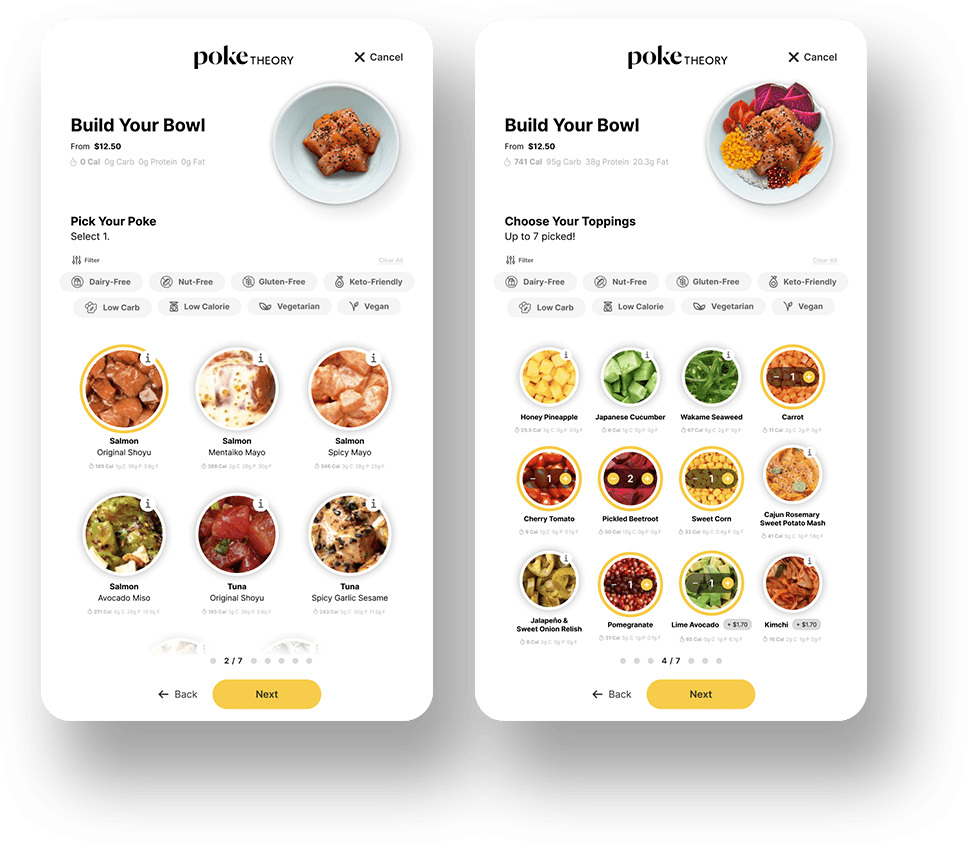
Mid-fi Wireframe
Improving the cart-out process for Build Your Own Bowl
One of the key challenges users pointed out with using the mid-fidelity prototypes was that they felt disoriented when clicking on the “Add to Order” button. Upon clicking the “Add to Order” button after they have finished building their poke bowls, they expect to be directed to their cart out page where they would be able to check their orders and proceed with payment but were redirected to the homepage instead. This led to confusion amongst users as they did not know where their order went to; it made them wonder if their order was lost and if they had to repeat the entire ordering process.

Mid-fi Wireframe
In order to fix this issue and give users more confidence that they are on the right track and their orders are not lost, we added an additional screen that allows users to either continue adding more items to their orders, or to simply head to the cart out page to confirm their order and make payment.
Designing a clear and systematic ordering system for customisation
From our user testing findings, we also found out that users do appreciate being able to track how far into the customisation process they are. Due to the high level of customisation that Build Your Own Bowl allows, we tweaked the UI slightly to include steps at the bottom of the screens, so that customers are able to track how far along they are into the ordering process and whether they’re almost reaching the end of the customisation process.

Mid-fi Wireframe
Providing clarity and instilling confidence in our customers such that they are fully aware of what they are ordering
In the earlier iterations of our mid-fidelity prototypes, users mentioned that they are unfamiliar with certain ingredients in the customisation list. To help instil confidence in our customers and create an easy to understand and clear ordering process, we’ve created mini info icons at the top right corner of uncommon ingredients where customers can click into to read more on what ingredients it is. Clicking into those mini info icons would prompt a small pop-up showing a short description of what that particular ingredient is, and can be very useful in guiding our customers on the food choices they wish to pick.

Mid-fi Wireframe
Final Design
Revised and Iterated
Lorem ipsum dolor sit amet


REFLECTIONS
Looking back at the whole process
Looking back at the past 8-9 weeks of working on this project to redesign Poke Theory’s self-order kiosk experience, we learnt that:
We should not rush into designing the product
It is important that we take a step back and look at the bigger picture of designing with user behaviour (needs, motivations, pain points) in mind instead of jumping straight into the specific interfaces directly. As we had different experiences with Poke Theory and approach in testing and interacting with our pool of users, it was inevitable that we carried our preconceived notions or biases into the research and design process along the way.
This is just the beginning of a cyclical, iterative design process
We found ourselves continuously nitpicking on minor UI changes, as well as incorporating new features into the prototype which were previously not part of our ideation process. However, the reality is the design process doesn’t stop after refining from one round of user testing. There’s always room for improvement, which expands our creative space to implement even more features into our design. If given the luxury of time to work on this project without chasing deadlines or any physical constraints, we believe it will further deepen our experience of continuously improving and adapting the product based on user feedback, and also tracking of real-time data on usage patterns. An iterative design process is ultimately key in making reliable, informed design decisions to create an even more valuable and user-friendly product that satisfies all users.
This begets the question:
